

The Brief
Newburryport Framers is a small, high-end framing business in the seaport town of Newburryport, Massachusetts. It is a mom & pop shop that designs mainly for locals who are as passionate about art and framing as they are. Their products and services include custom framing, matting, shadow box construction, and other kinds of artistic framework. The goal was to create a logo related to framing that projects a sense of premium craftsmanship, to instill desire for the product, and to create a local identity unique to Newburryport. There is no on-staff graphic designer to maintain a design plan, so we have to design a logo strong enough to carry the weight in many forms. It has to look good and function well even when misapplied.
The Audience
Current Customers - They appreciate a stylish logo because they enjoy associating with a cool piece of business and they value the reinforcement that they've made a good buying decision.
Employees - Your brand is your identity, so your brand is your employee's identity too. It can provide a sense of place and belonging. When done well, logos amplify connecting and unifying qualities which employees enjoy being a part of.
Old Logo Problems

- "F" placed on top of "N".
- Makes tiny trapped spaces and interactions that don't naturally exist in the typeface.
- Busy, noisy, and complex.
- Creates multiple crazy shapes and iterations.
Building the Brand Foundation
Defining the Clients World.
After several trips to Newburryport, our team was able to express why the town is unique.
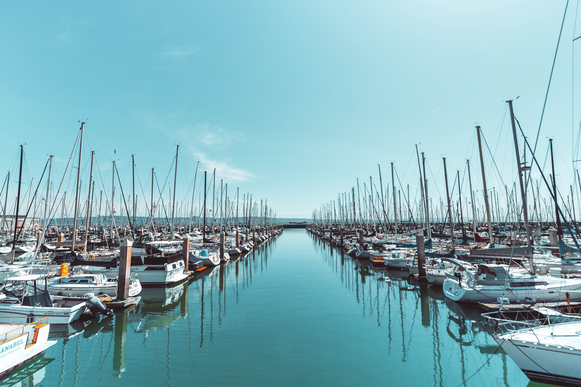
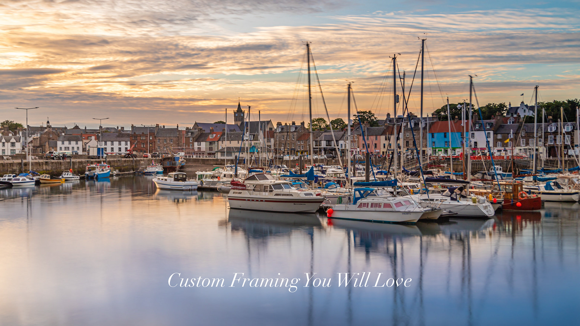
Newburryport was settled by English tradesman almost 400 years ago and grew into a trade center. A sense of history and a sense of place are at the core of the the towns identity.

The ocean is nearby, giving us potential nature themes such as sand, shells, fish, waves, birds, driftwood, sunsets and sailboats.
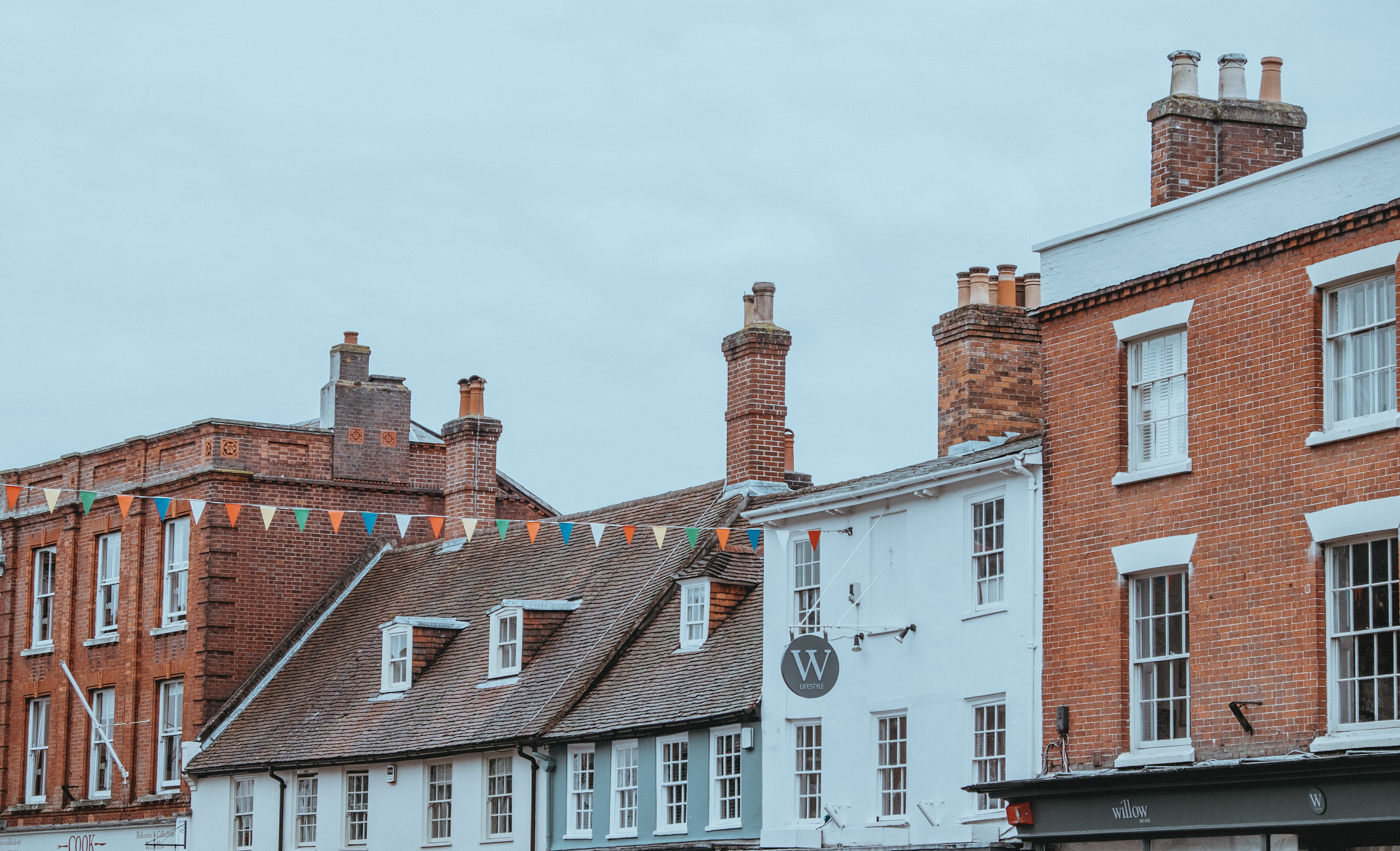
The town's architecture includes historic New England brick buildings, cobblestone streets, and abstract signs.

The shop provides a range of frame varieties including modern, vintage, wood grain, hand made, wide, narrow, oval, and iron.
Design Exploration
Based on the brand foundation created above, multiple logo designs were developed through an exercise called Forced Random Connections; two key terms were paired together to help brainstorm design ideas for Newburryport Framers.


First Logo Result
The strongest result was determined to be frame corners hanging on a wall.
- Simple.
- Geometric.
- Easily identifiable.
- A hint of waves, all the environmental connection that we need.
- Effortless, meaning the image is only seen in frame shops, so it requires no interpretation to know what it means.
- All sizes and colors work.
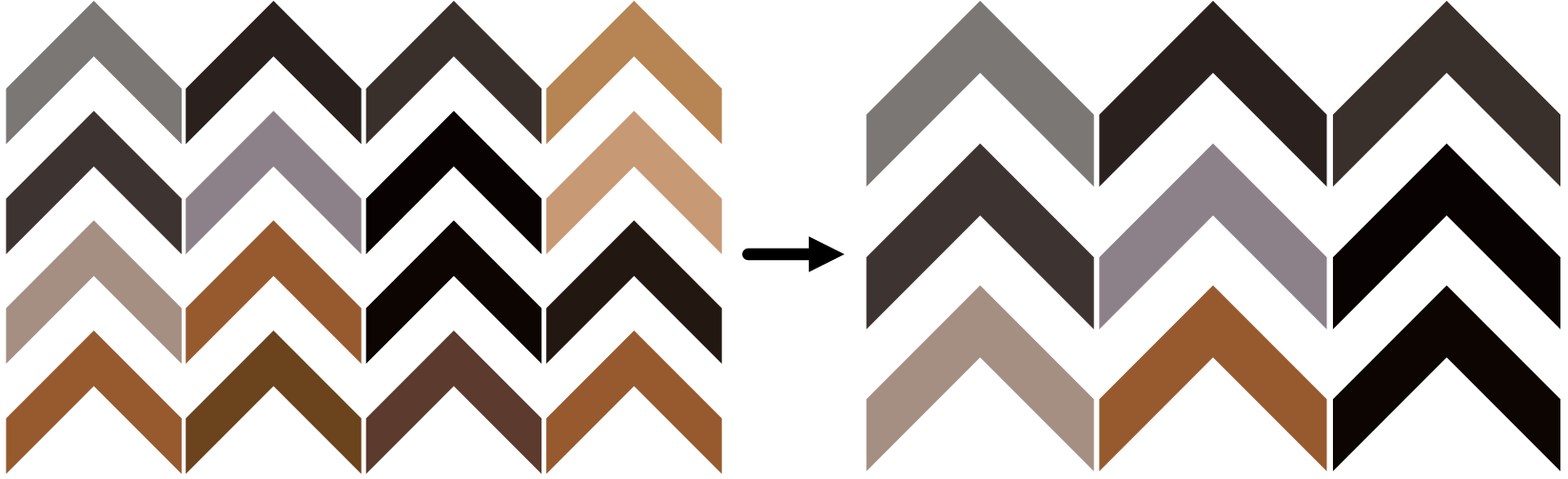
Revisions
Problem: The tight corners look too much like a single object than separate corners, and the thin negative space lines would disappear at small sizes.
Solution: Separate the rows by a full frame width. The result improves because now it is more open and there are equal amounts of positive and negative space so its clearer and wavier.
Final Step: Eliminate one row and one column, making the image as simple as we can without losing it.
Typeface
- Didot LT Pro conveys a high end feel because it is physically neutral and classy. The lines and general build pair with the logo to speak in one voice.
- Didot is in the typographic class called "moderns", which are extremely popular in the fashion world. This close association with fashion transfers a high end vibe whenever it is used.
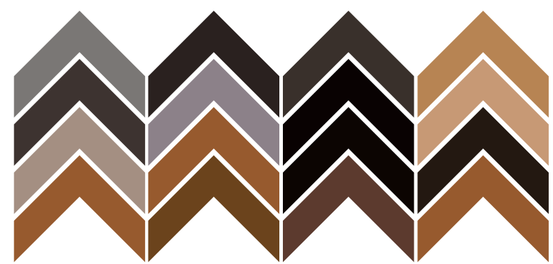
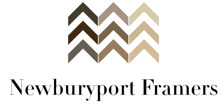
Colors
- Colors were harvested from the different colors on a frame wall.
- Rich and deep palette.
- A gradient was applied to emphasize horizontal movement, like waves. The pattern gradients from dark to light, left to right representing a whole spectrum of frames.
Final Logo
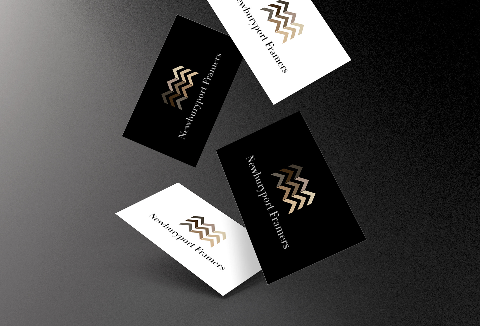
Mockups
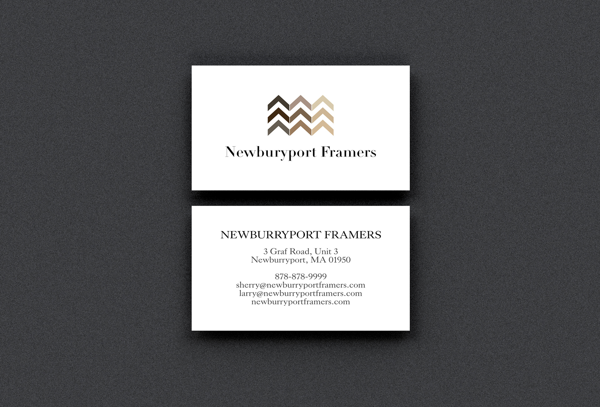
Business cards with logo centered on front and business information centered on back.
Centered logo business cards.
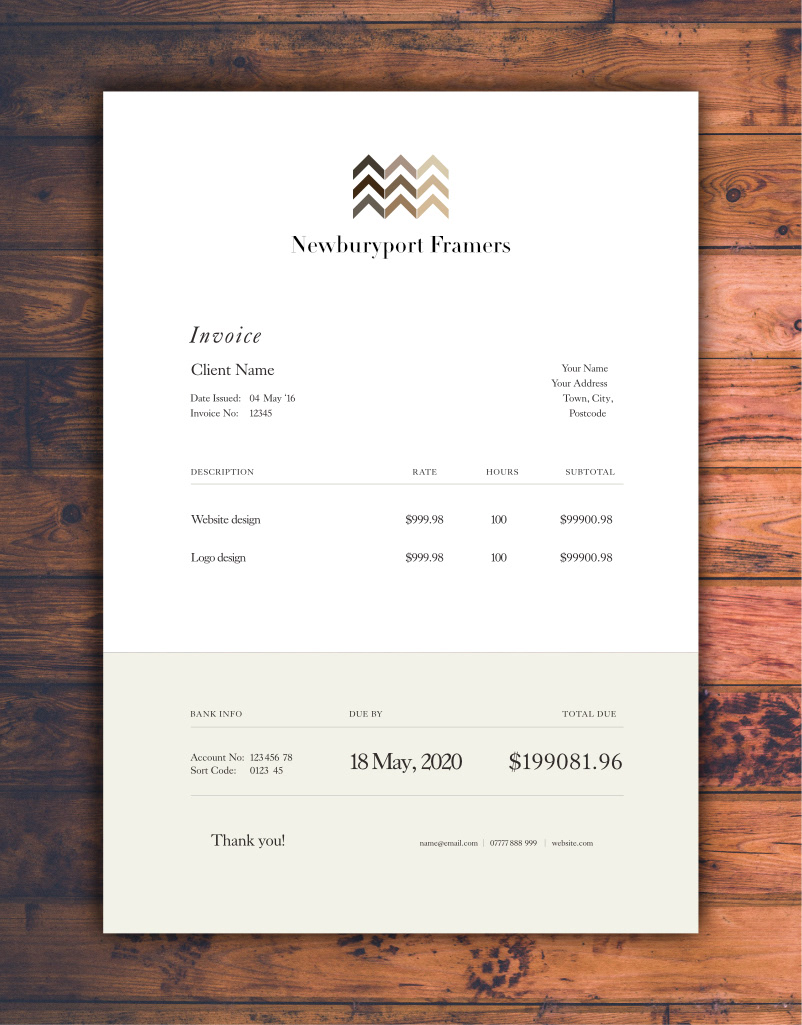
Paper Invoice
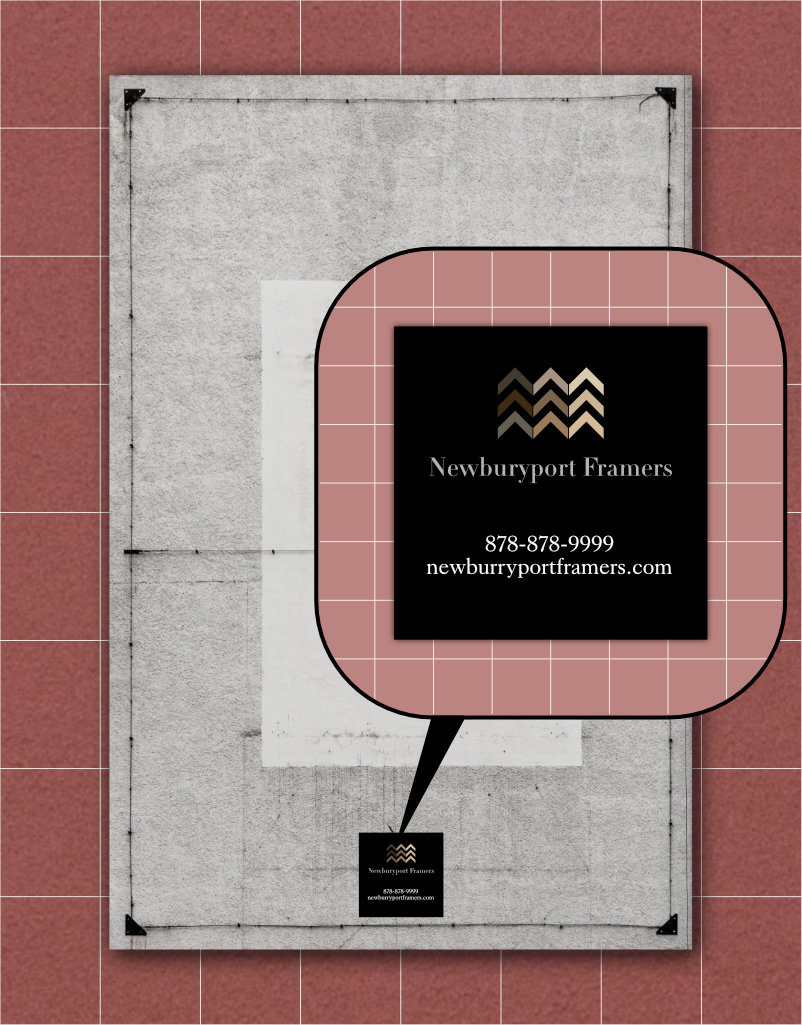
Sticker label on the back of every frame
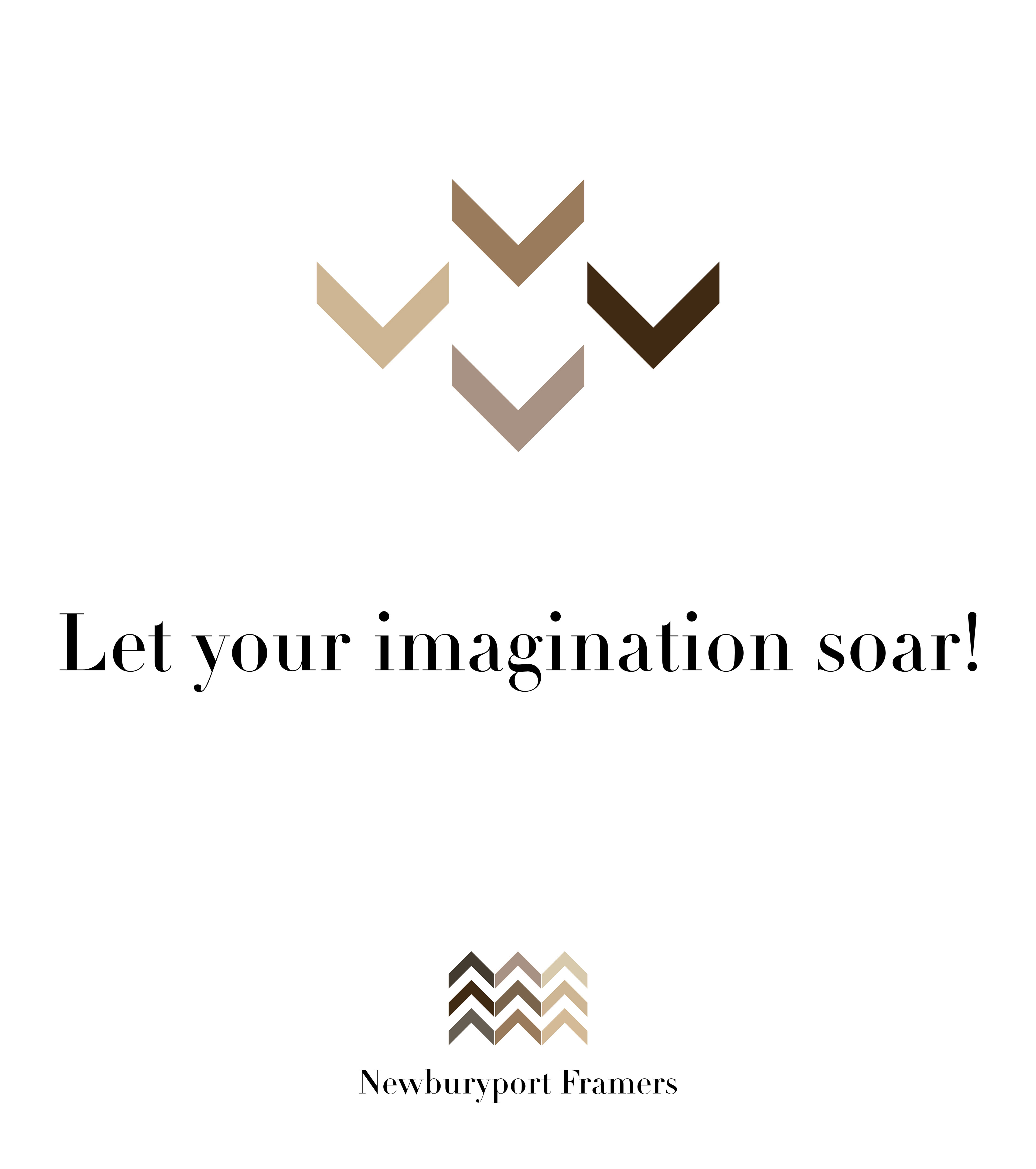
In store poster, keeping the picture frame logo theme with a hint of a nature element (birds).

Gift Certificate
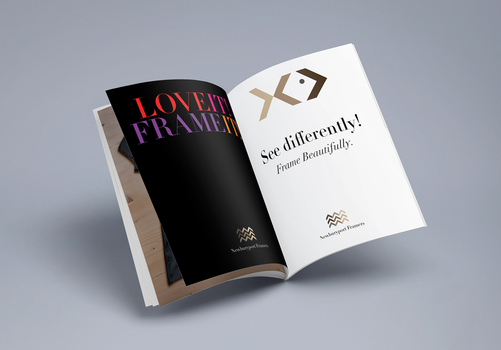
Magazine Advertisement
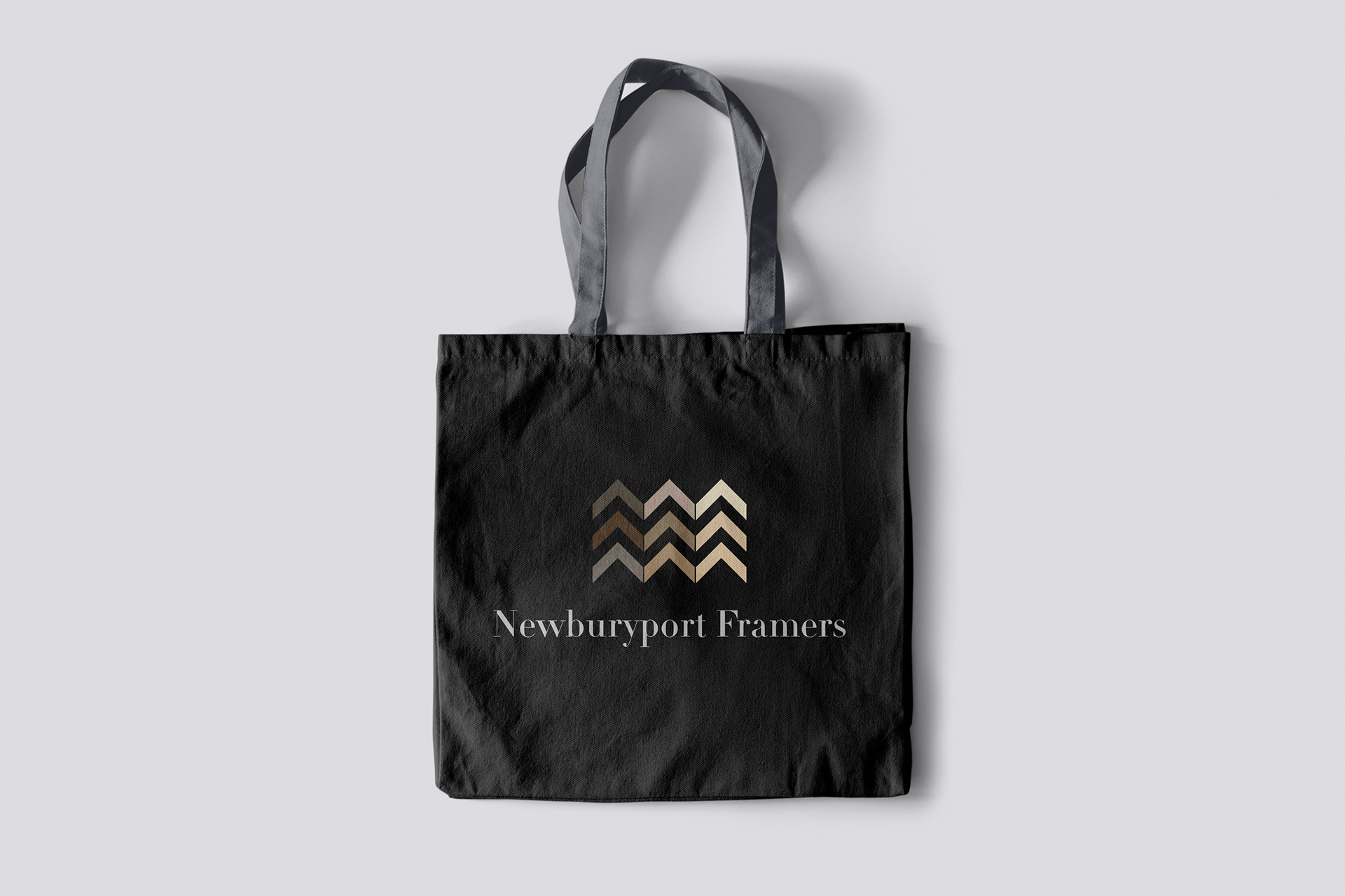
Canvas tote bag
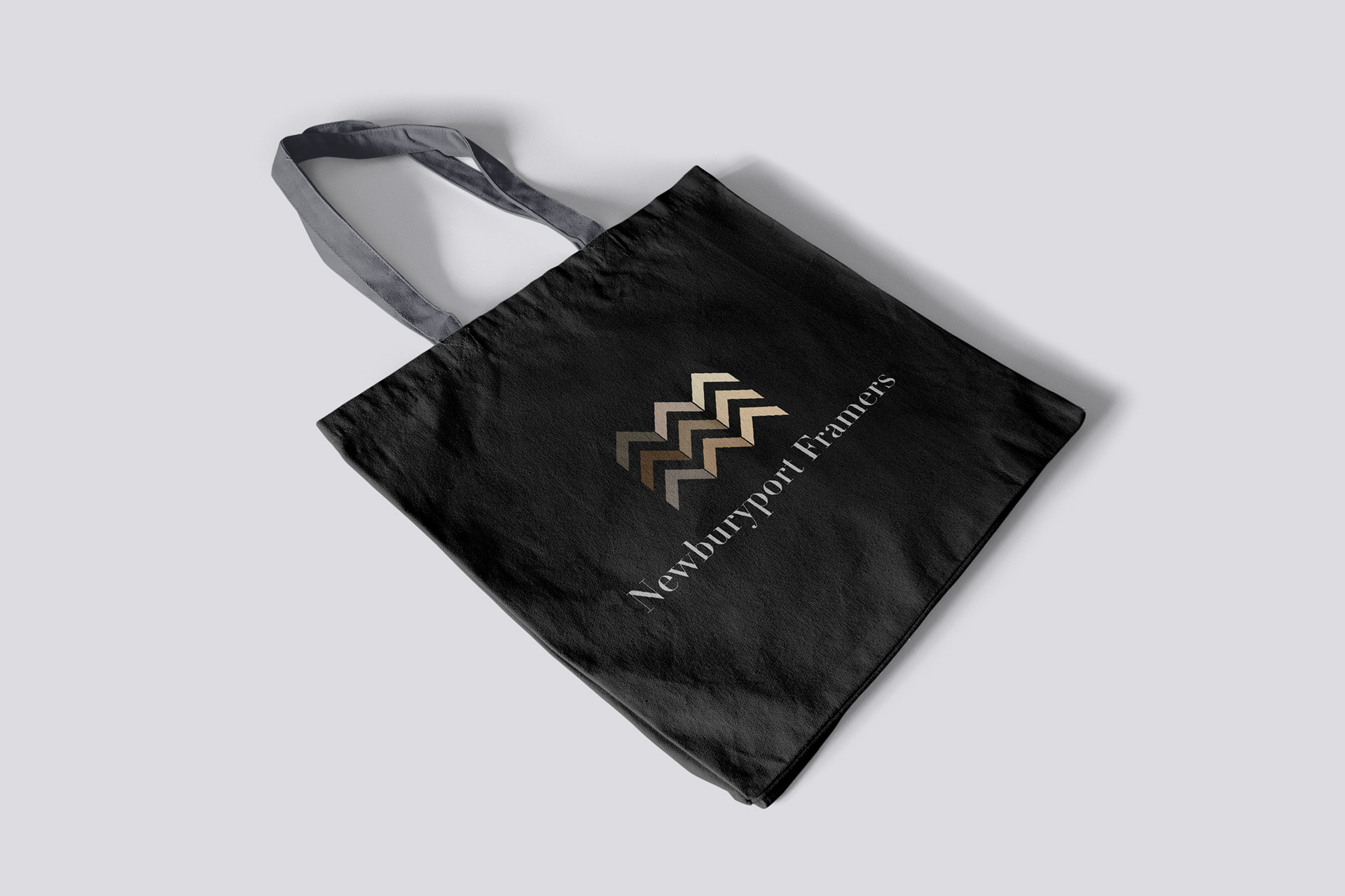
Canvas tote bag
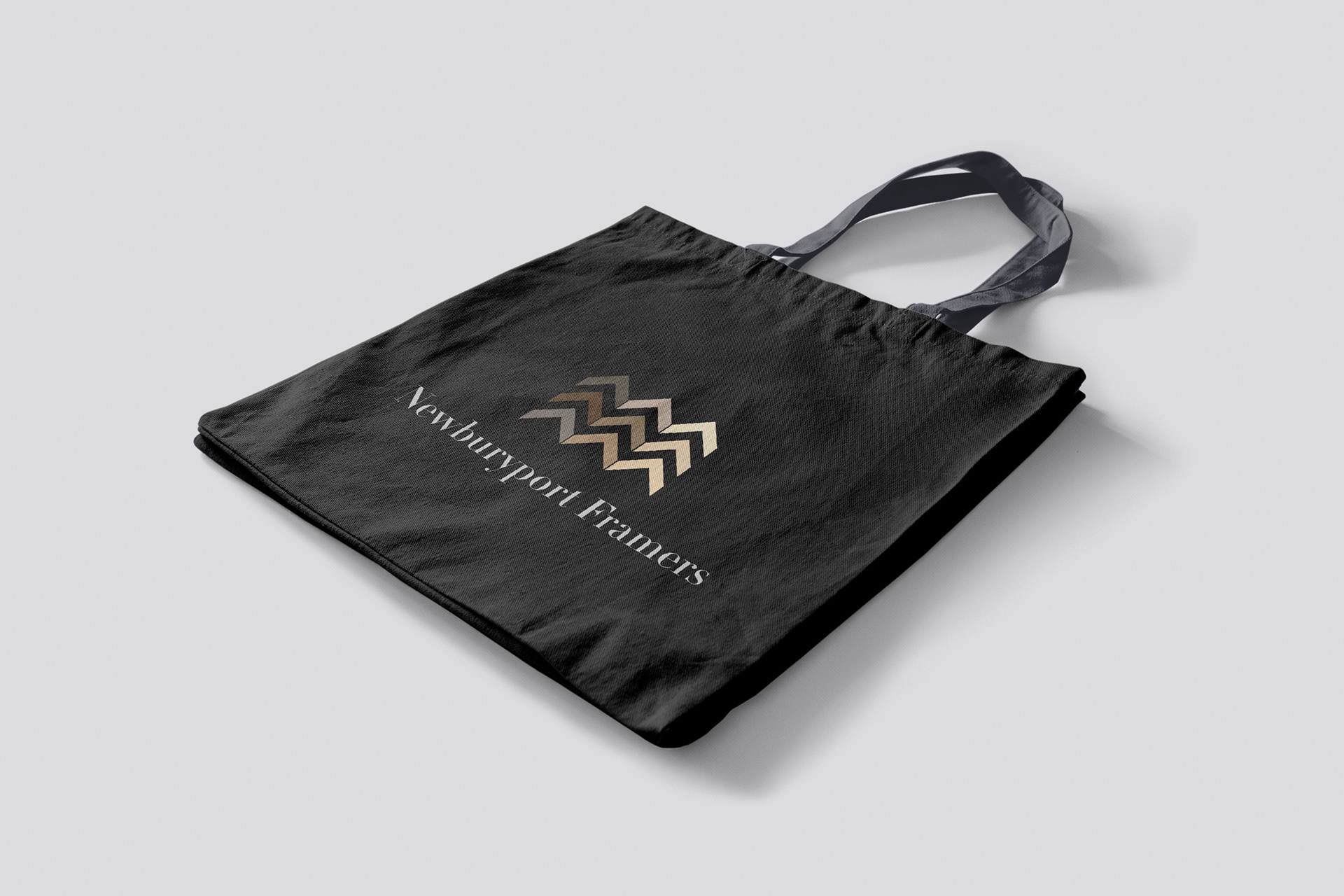
Canvas tote bag
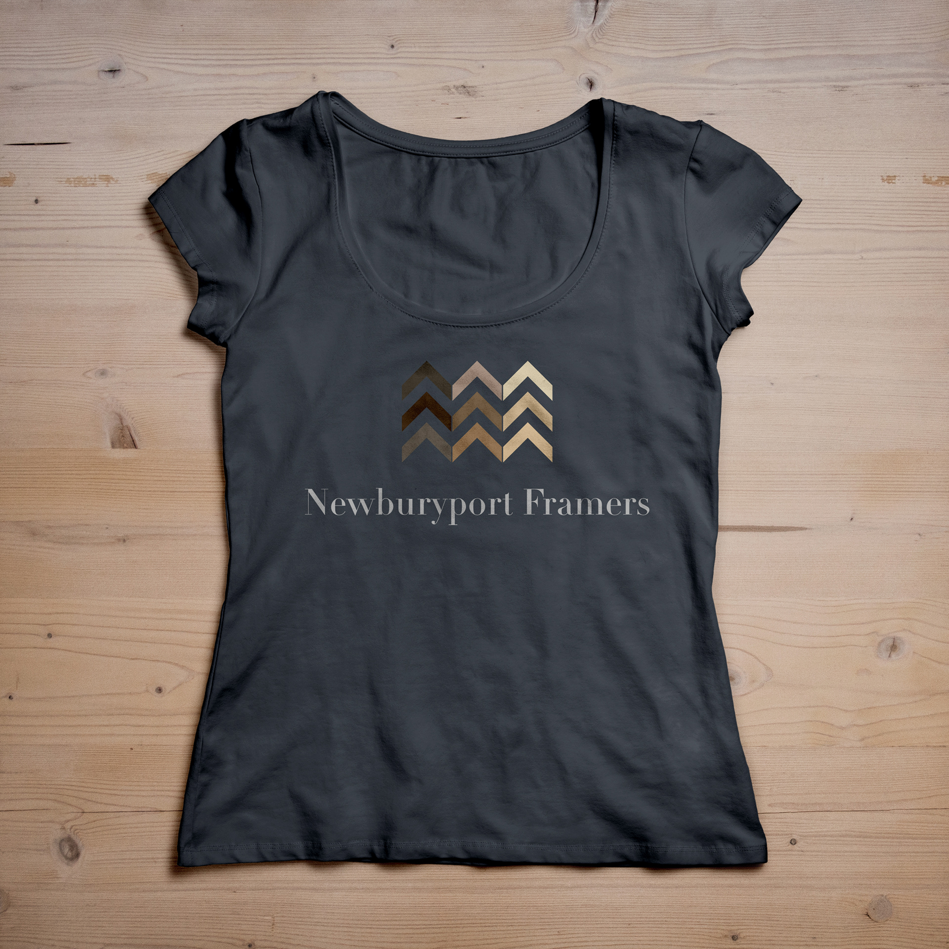
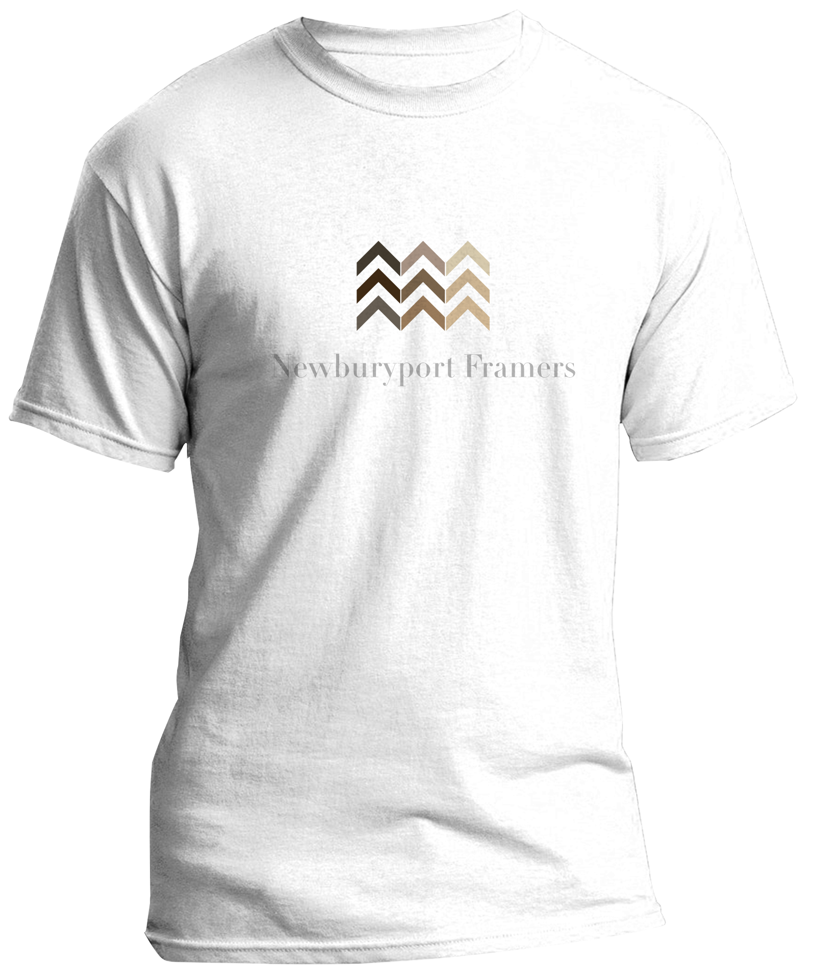
Women's shirt, front
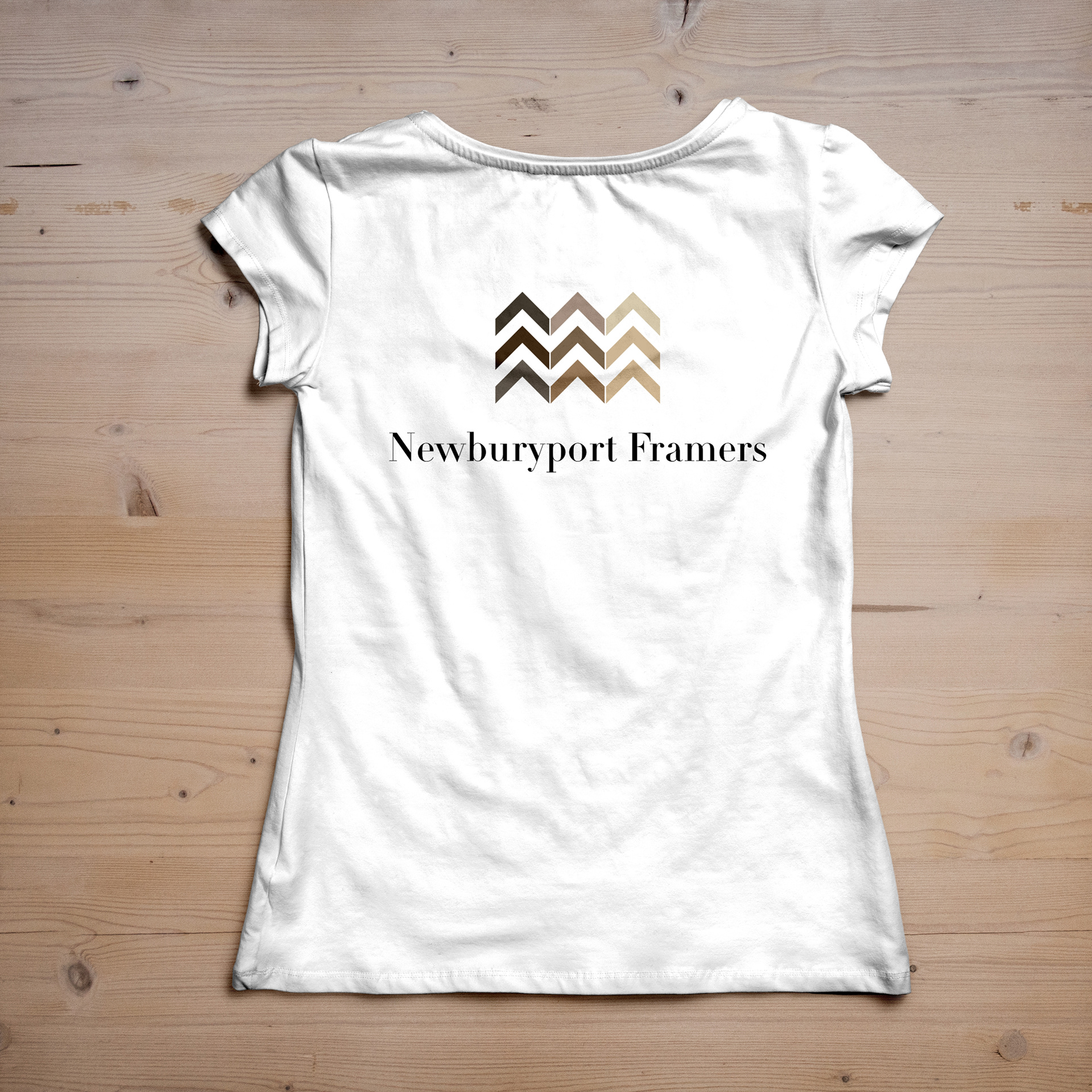
Women's shirt, back
Men's shirt
Men's shirt, text only
Final Thoughts
Newburryport Framers does not have an in house designer, so instructions were left behind to help the client work with the logo:
- Logo is a center design, so keep it centered.
- Keep size relationships between logo and words uniform.
- Because its a center design , it should also be centered in whatever space it appears in, and other elements of page should also be centered. There are some natural limitations to this , but wherever possible, center things.
- You always want the logo in open space, not crowded by other things. Create a buffer zone around the logo and just consider it part of the design.
Keep these practices in mind and the look can be transferred practically anywhere.


